CSS
NOTE: for a more comprehensive CSS tutorial go to w3schools.
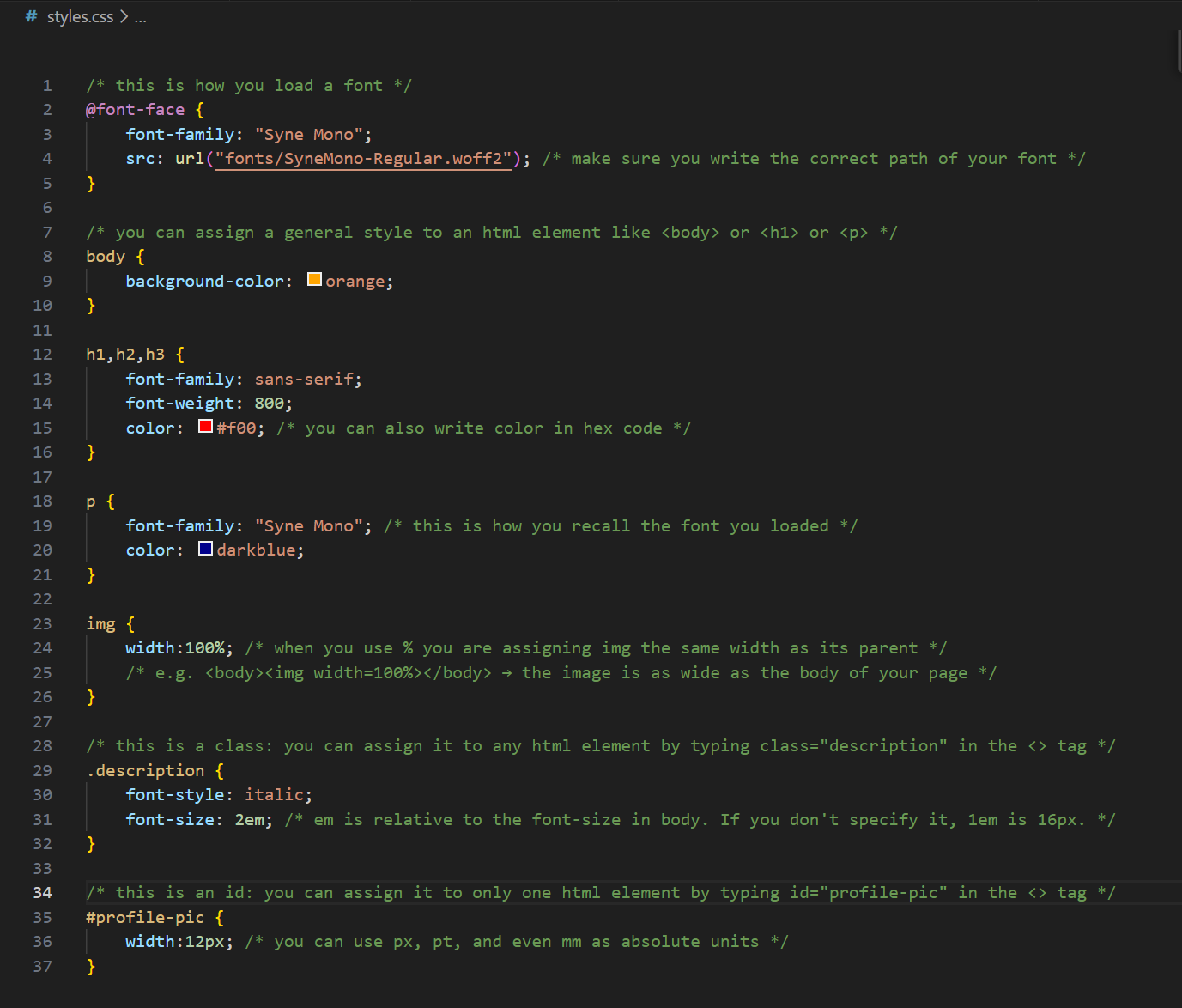
Cascading Style Sheet
A CSS document contains a structured collection of all the styling rules for one (or more) HTML pages. It looks like this:
Using CSS
CSS can be used directly inside an html element, in the <head>, or in an external document.
Using CSS in an HTML element
Any element can use the attribute style, in which you can inject CSS properties
<body>
    <h1 style="font-size:1.5em">bigger font size</h1>
    <p style="color:red">red text</p>
</body>
Using CSS in head
You can also save time and use a general set of rules for ALL elements in your HTML. You do that by using a <style> tag inside <head>
<head>
    <style>
        h1 {
            font-size: 1.5em;
        }
        p {
            color: red;
        }
    </style>
</head>
<body>
    <h1>bigger font size</h1>
    <p>red text</p>
</body>
Linking an external CSS document
If your CSS becomes too lenghty, or if you want to share it with other pages, you can <link> it as a stylesheet in your <head>.
<head>
    <link rel="stylesheet" href="style.css">
</head>
<body>
    <p>red text</p>
</body>
/* style.css */
p {
    color: red;
}
Selectors in CSS
CSS selectors are used to find the HTML element you want to style.
For a comprehensive tutorial on all 5 categories of selectors, go to w3schools CSS selectors. Here, we just look at simple selectors:
- tags
- classes
- ids
Tags
Tags are the name of the element you use: h1, p, img, body, etc... They affect every element of the selected type.
Classes
Classes are a special category you can assign to any element to make it stand out from its similar types.
Say, for example, you want all paragraphs to be black and small, but some should be red. You would give a special class to the red paragraphs.
<head>
    <link rel="stylesheet" href="style.css">
</head>
<body>
    <p>small text</p>
    <p class="red-text">red text</p>
</body>
Then, in CSS, you would assign a small font-size to ALL paragraphs and a red color to the special paragraphs.
/* style.css */
p {
    font-size: 0.8em;
}
.red-text {
    color: red;
}
IDs
IDs are similar to classes but can only be assigned to one, unique, element. IDs are kind of special because you can use them as a URL.
For example: https://poeticweb.net/trajectory/css.html#selectors is the URL for the heading above that says "Selectors in CSS".
This is what it looks like in HTML:
<h2 id="selectors">Selectors in CSS</h2>
IDs can also be called in CSS using the # symbol
tag {
    property: value;
    }
.class {
    property: value;
    }
#id {
    property: value;
    }
Pseudo-selectors
Pseudo-selectors let you style an element when it is in a specific state.
The most common one is :hover, which activates when your mouse is over an element.
For example, we can make an image grow when we hover over it:

<img src="media/monkey.png">
/* style.css */

img {
    width: 100px;
}

img:hover {
    width: 300px;
}
Transitions
By default, CSS changes happen instantly.
If we want the change to happen gradually, we use the transition property. Find out more about
it at w3schools CSS transitions.
Let's make the image resize smoothly over 1 second.
/* style.css */

img {
    width: 100px;
    transition: width 1s;
}

img:hover {
    width: 300px;
}
Layout: Flexbox and Grid
CSS can also control how elements are arranged on the page.
Two important layout systems are display: flex and display: grid.
Flexbox
Flexbox arranges elements in a row or column. By default, it places items next to each other in one row, but you can justify or center content more accurately.
<div class="flex-container">
    <div></div>
    <div></div>
    <div></div>
</div>
<div class="flex-container">
    <div></div>
    <div></div>
    <div></div>
    <div></div>
</div>
<div class="flex-container">
    <div></div>
    <div></div>
    <div></div>
    <div></div>
    <div></div>
    <div></div>
</div>
.flex-container {
    display: flex;
    justify-content: space-between;
}
You can learn the inside-outs of flexbox at: flexboxfroggy.com
Grid
Grid arranges elements in rows and columns.
Here we create 3 columns and automatically fill two rows.
<div class="grid-container">
    <div></div>
    <div></div>
    <div></div>
    <div></div>
    <div></div>
    <div></div>
</div>
.grid-container {
    display: grid;
    grid-template-columns: 1fr 1fr 1fr;
    gap: 10px;
}
Learn inside-outs of grid at: cssgridgarden.com